 I have written quite a lot about the use of local maps that emphasise the identity of an individual or of a place. However, there are also incredibly creative uses of maps that are more in the Cartesian tradition, combining geospatial data and digital mapping to creative visualisations that may be informative, subversive, beautiful and, at their best, all three at once.
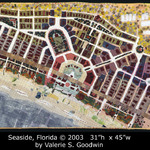
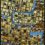
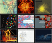
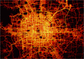
As part of her master’s studies Margarida Fonseca has created Flowing City, a stunning collection of visualisations of urban data. From routes of Beijing cabbies, to galvanic skin response in Greenwich, and social network language in Milan, the examples Margarida has collected show the amazing ways different projects and individuals are remixing their own data, or publicly available data in order to make the often unseen patterns around us visible.
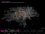
Many of the projects are by university research groups, but I’m also aware of many basic, but often transformative uses of data by simply mixing open data with Google maps or other similar technologies. I’m wondering what it would be like if visualisations such as those found in Flowing City could be in the hands of every community group, urban or rural: campaigning for better transport, understanding education needs, preparing for floods. But while pondering that I have downloaded a copy of Margarida’s thesis.
So, just browse the Flowing City site, compare with the Maps in Textiles I posted about a week ago: art and technology, the Cartesian and the idiosyncratic, may be not so far apart.

 The Ordnance Survey in collaboration with the British Cartography Society, have announced an award, the OS OpenData award, for work that spans art and cartography, using the hard data supplied in OS OpenData but combined with the flair of the creative individual.